oghenefejiro

My Role

As the designer responsible for improving Trifta’s digital interfaces, I was tasked with:

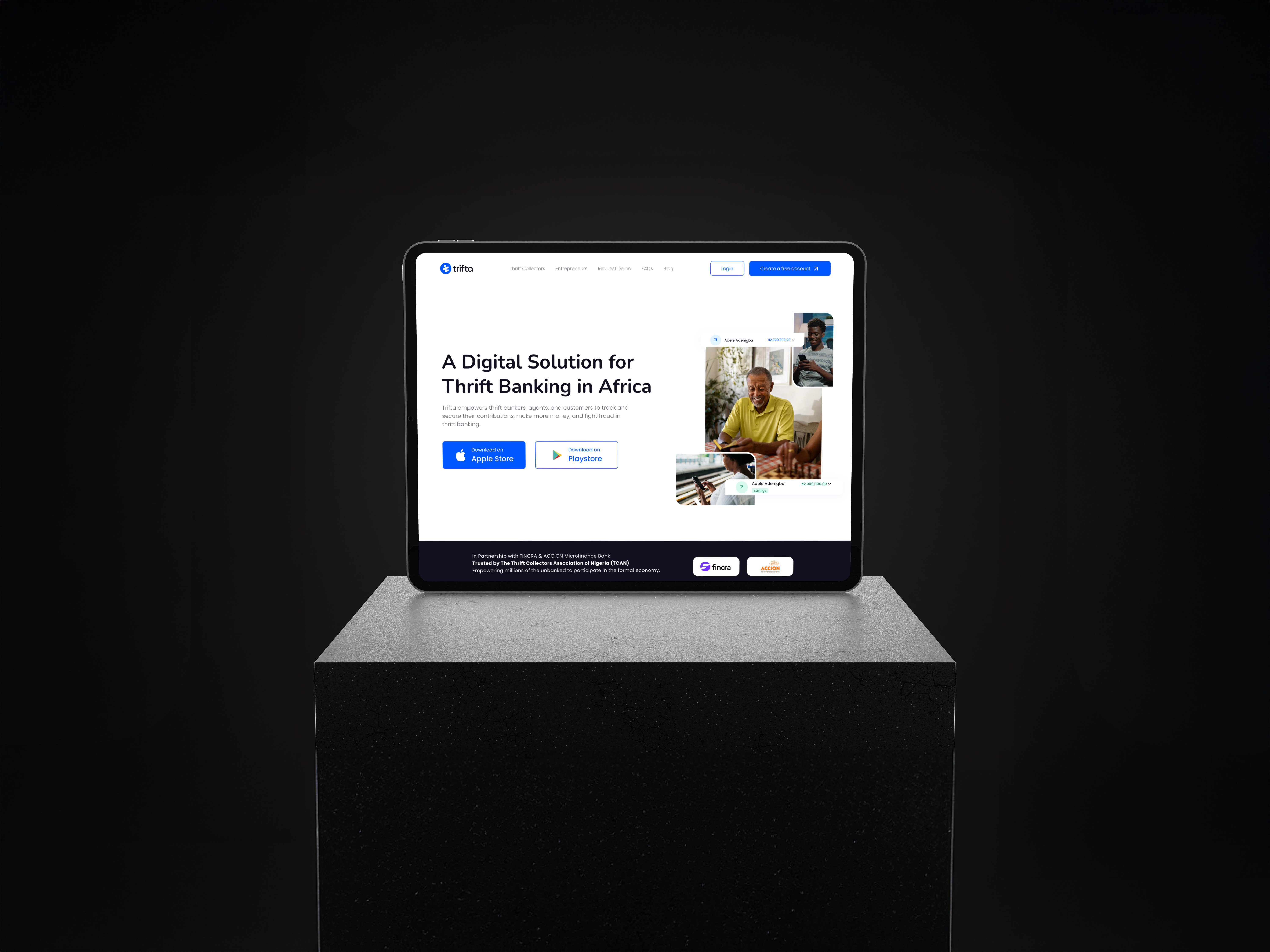
  • Redesigning the website: Focusing on improving the overall user journey, modernizing the interface, and making the website more accessible.

  • Designing the POS application: Creating an intuitive design that enabled merchants to handle transactions easily in low-resource environments.

  • Designing web applications: Optimizing both admin and user interfaces to ensure efficient handling of savings, and customer management.

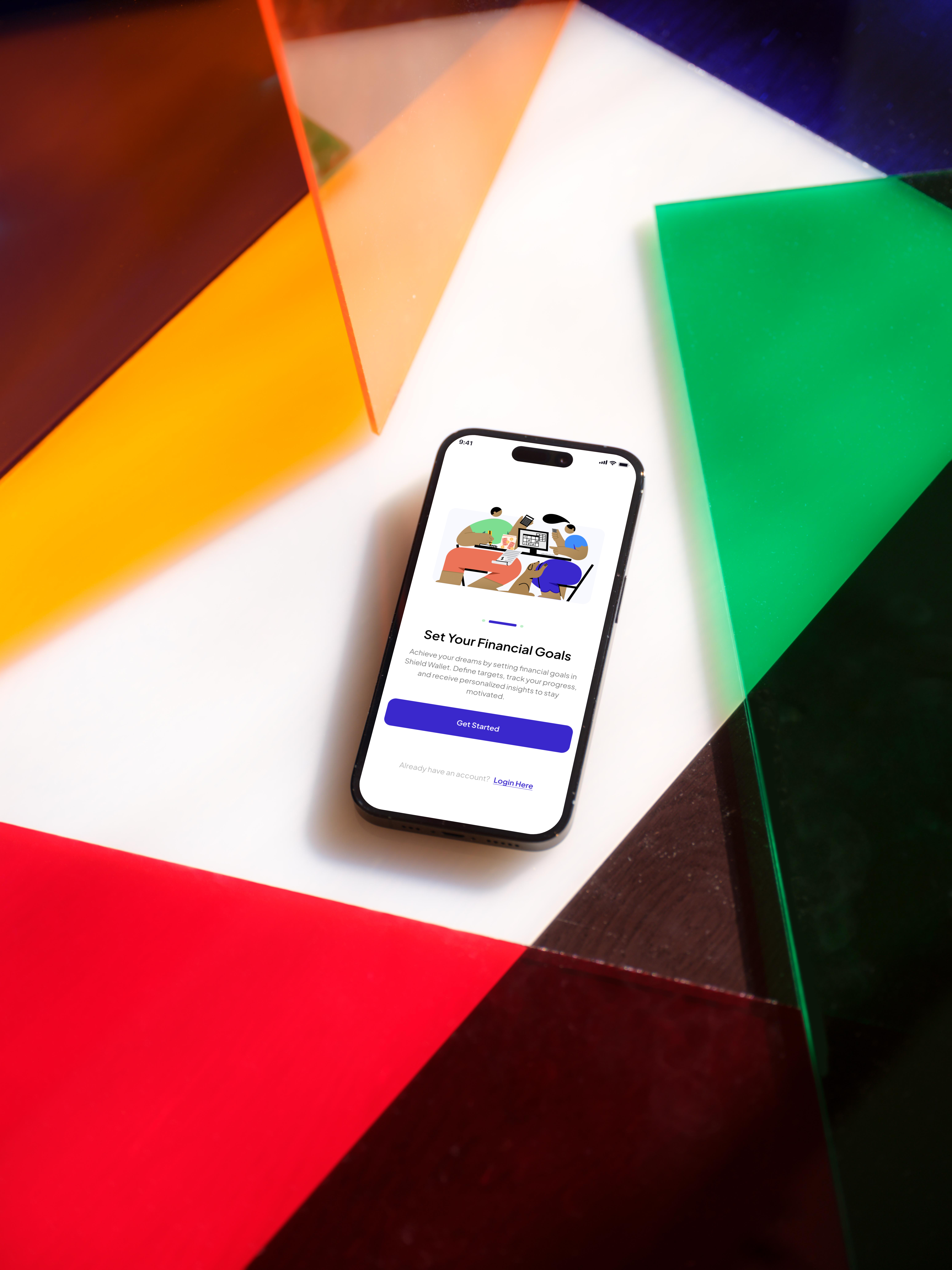
  • Redesigning parts of the mobile app: Enhancing the usability of the mobile interface, focusing on making the app more accessible to the target audience.

Design Process

To address these challenges, I applied design thinking methodologies, focusing on the needs and behaviors of Trifta’s users. My process included the following steps:

  • User Research: I conducted user interviews and competitive analysis to understand the pain points faced by merchants and low-end users. This research provided key insights into how merchants handled financial transactions and where the platform was failing them. I also analyzed competing financial platforms to identify areas where Trifta could offer a unique and more effective solution.

  • Wireframing and Prototyping: Using tools like Miroboard and Whimsical, I reviewed and modified wireframes provided by the product manager, as well as created low-fidelity prototypes. These allowed me to explore various design possibilities quickly and iterate based on feedback from stakeholders and user testing.

  • Design Tools: For visual design and interaction, I utilized Figma, Blender, Adobe Illustrator, and Adobe After Effects. These tools helped create a modern, cohesive visual language for the platform while focusing on simplicity and usability for low-end users.

Key Solutions and Features

Through extensive research and iteration, I developed a series of key solutions:

  • Website Redesign: The new design was focused on improving navigation and enhancing the user journey. By simplifying the homepage and prioritizing key actions, merchants were able to access vital services like savings management, loans, and customer interactions more easily. The design was also optimized for low-data usage, ensuring users with slower internet connections could still interact with the platform effectively.

  • POS Application Design: This design focused on quick access to core features like transaction tracking and loan management, allowing merchants to operate efficiently in busy market environments. The interface was designed to be easy to use in low-light and fast-paced conditions, supporting merchants with clear icons and minimal steps to complete tasks.

  • Web Applications: The admin and user interfaces were streamlined to provide a more intuitive experience. Admins could now manage user accounts, savings, and loans with ease, while users gained clearer access to their account details, contributions, and loan statuses.

  • Mobile App Enhancements: The redesign of the mobile app introduced an improved user interface that was visually cohesive with the web platform. Accessibility features were added, such as larger text and simplified navigation, ensuring that even users with limited digital literacy could interact with the platform comfortably.
Challenges Faced

The redesign process wasn’t without challenges:

  • Balancing modern design with accessibility: One of the key challenges was creating a design that felt modern yet remained accessible to low-end users. Many of the merchants using Trifta operated in low-resource environments with older devices and slower internet connections. The designs had to be optimized for performance on low-end smartphones while maintaining a clean and user-friendly interface.

  • Stakeholder alignment: Balancing the expectations of various stakeholders was another challenge. Business leaders were focused on increasing merchant sign-ups and engagement, while the development team needed to ensure the designs were feasible for implementation within existing technical constraints.

  • Communication with developers: There were times when translating design ideas into technical specifications required close collaboration with the engineering team, ensuring that the user experience didn’t suffer from technical limitations.

Outcome

The redesign efforts at Trifta led to several positive outcomes, primarily driven by increased engagement and early adoption:

  • Increased social media engagement: From the social media designs I made, there was a significant boost in engagement on Trifta’s social media posts and pages, with more interaction from merchants who discovered the platform through these posts. This helped raise awareness of Trifta’s services and drew more interest from potential users.

  • Increased merchant interest: The social media campaign also led to increased engagement from merchants, many of whom were interested in joining the platform and learning more about the savings and loan services offered.

  • Enhanced user interface (beta users): Although the redesigned user interface was only accessible to beta users, the feedback from this group was positive, showing improved navigation and overall user satisfaction with the platform.

  • Platform adoption (beta users): Similarly, early platform adoption among beta users indicated that the improvements in usability and accessibility were successful. This laid a strong foundation for a broader launch in the future.

Conclusion

My experience at Trifta was both challenging and rewarding. By designing with the needs of underserved communities in mind, I learned the importance of balancing accessibility with modern UX design principles. Working on financial inclusion initiatives allowed me to grow as a product designer, equipping me with the skills to design for diverse user bases and tackle complex user experience challenges. This project reinforced my commitment to using design as a tool to create more equitable solutions for underrepresented groups.