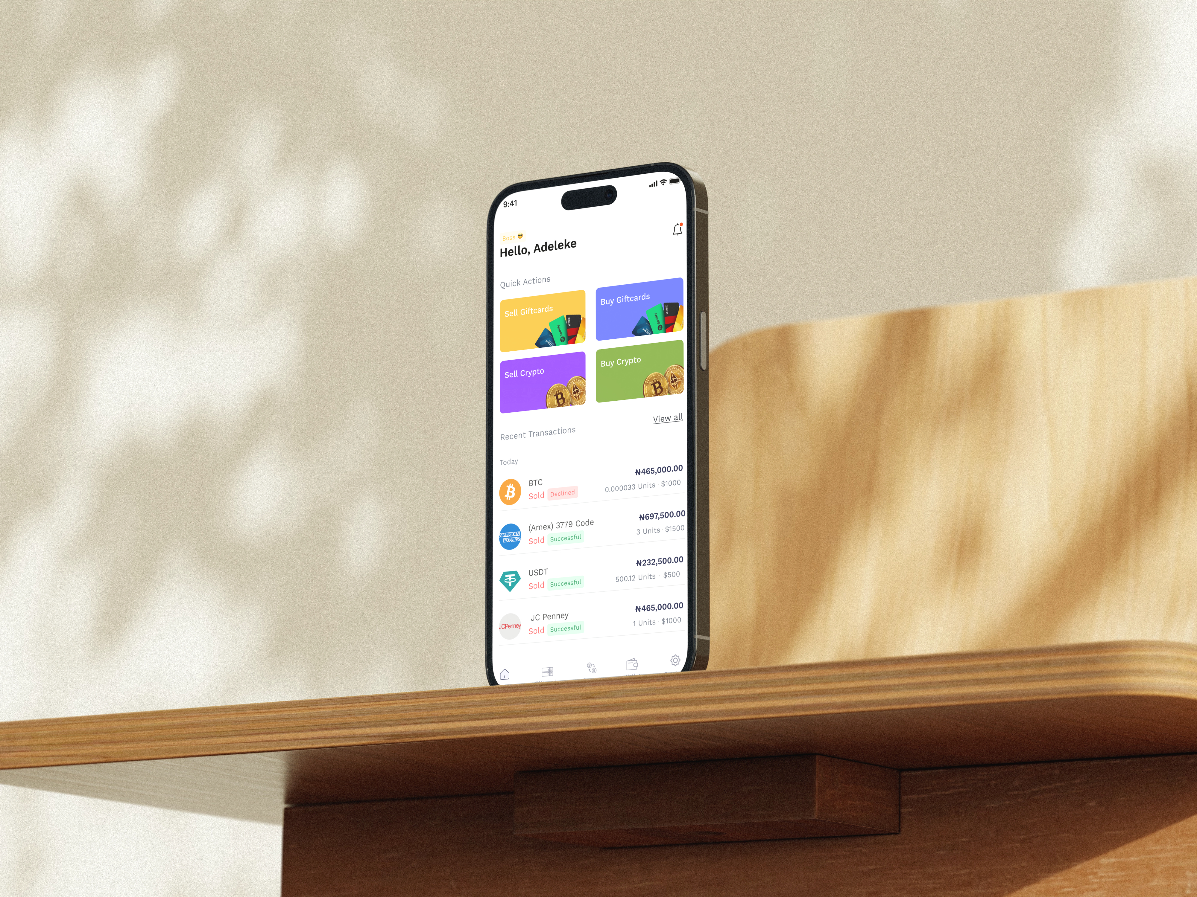
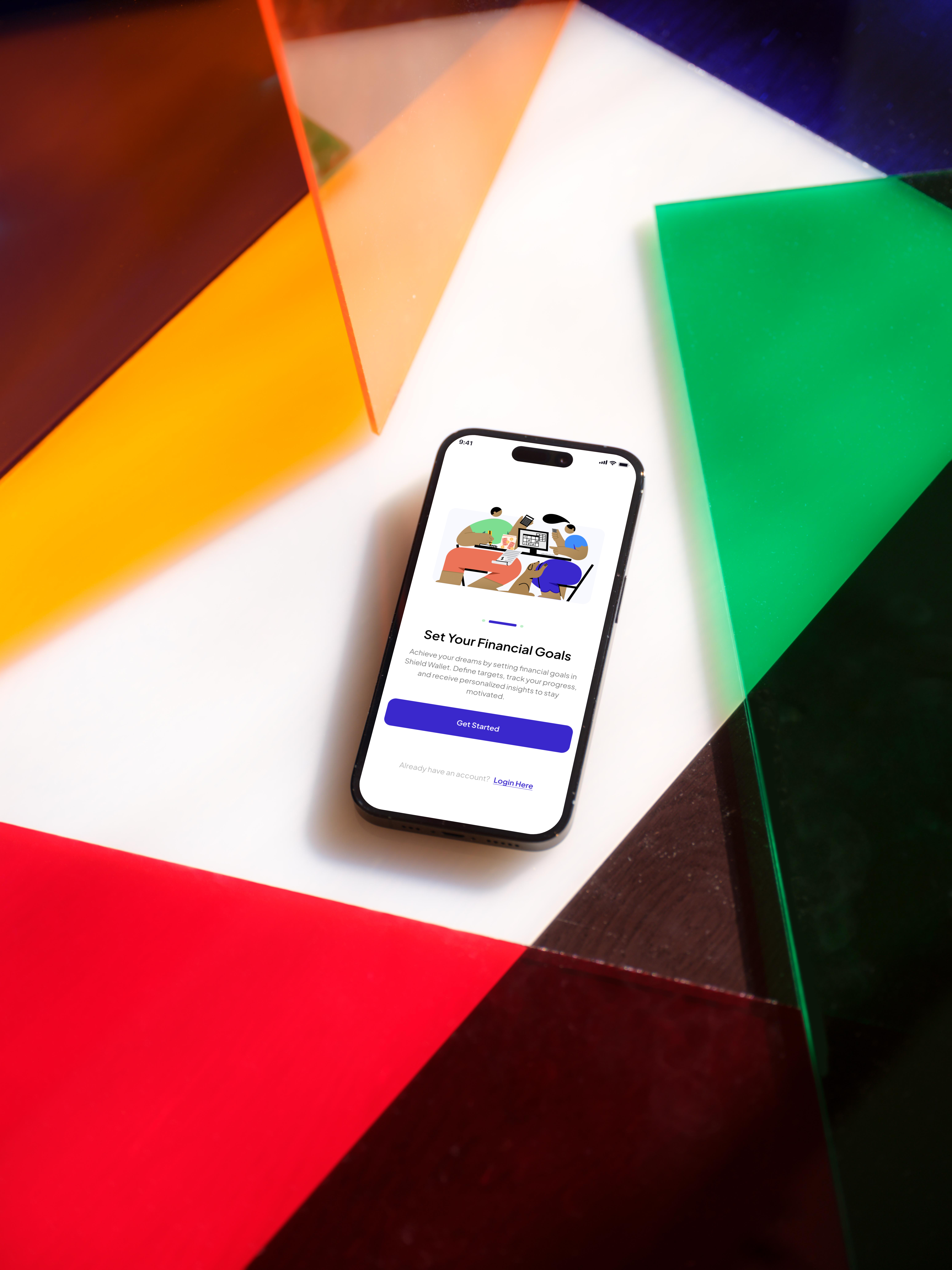
The redesign addressed all three friction points through targeted changes to onboarding, navigation, trading, and the web platform. Every decision was grounded in a single principle: reduce perceived risk, and conversion follows.
Insight 01 — Onboarding & Authentication
Removing barriers at the first moment of trust
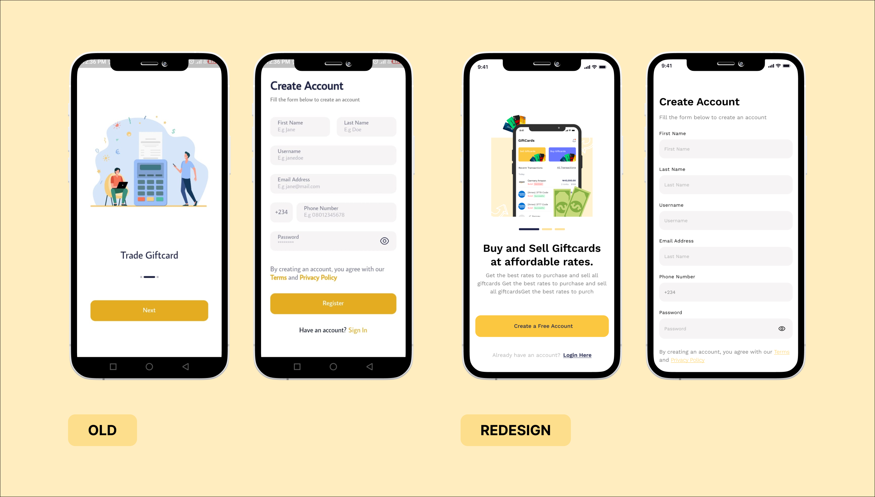
The original sign-up flow front-loaded too much friction. Users faced unlabelled fields with no context, no clear progress indication, and no alternative to creating a new account from scratch. Anxiety at sign-up translates directly to drop-off.
The redesigned flow broke sign-up into progressive, digestible steps. Each field was given contextual microcopy explaining why the information was needed. Google and Apple sign-in were introduced as low-friction entry points, removing the biggest psychological barrier for new users entirely.
Insight 02 — Navigation & Transaction Visibility
Giving users control and visibility over their own money
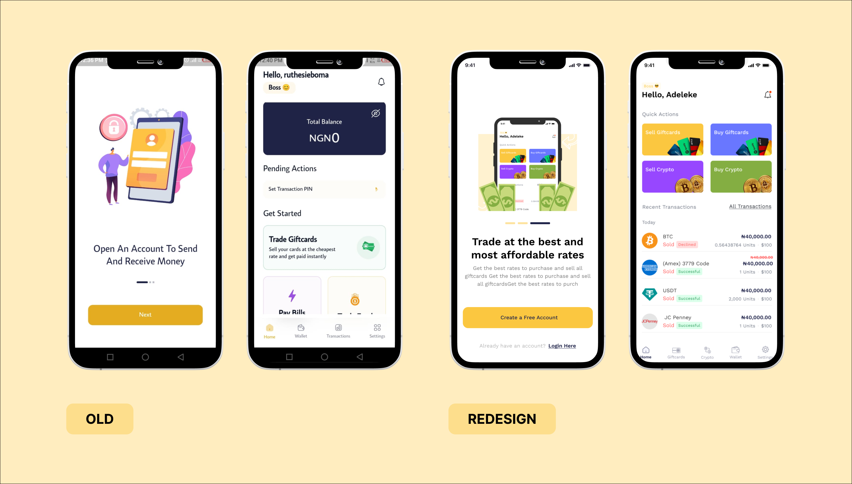
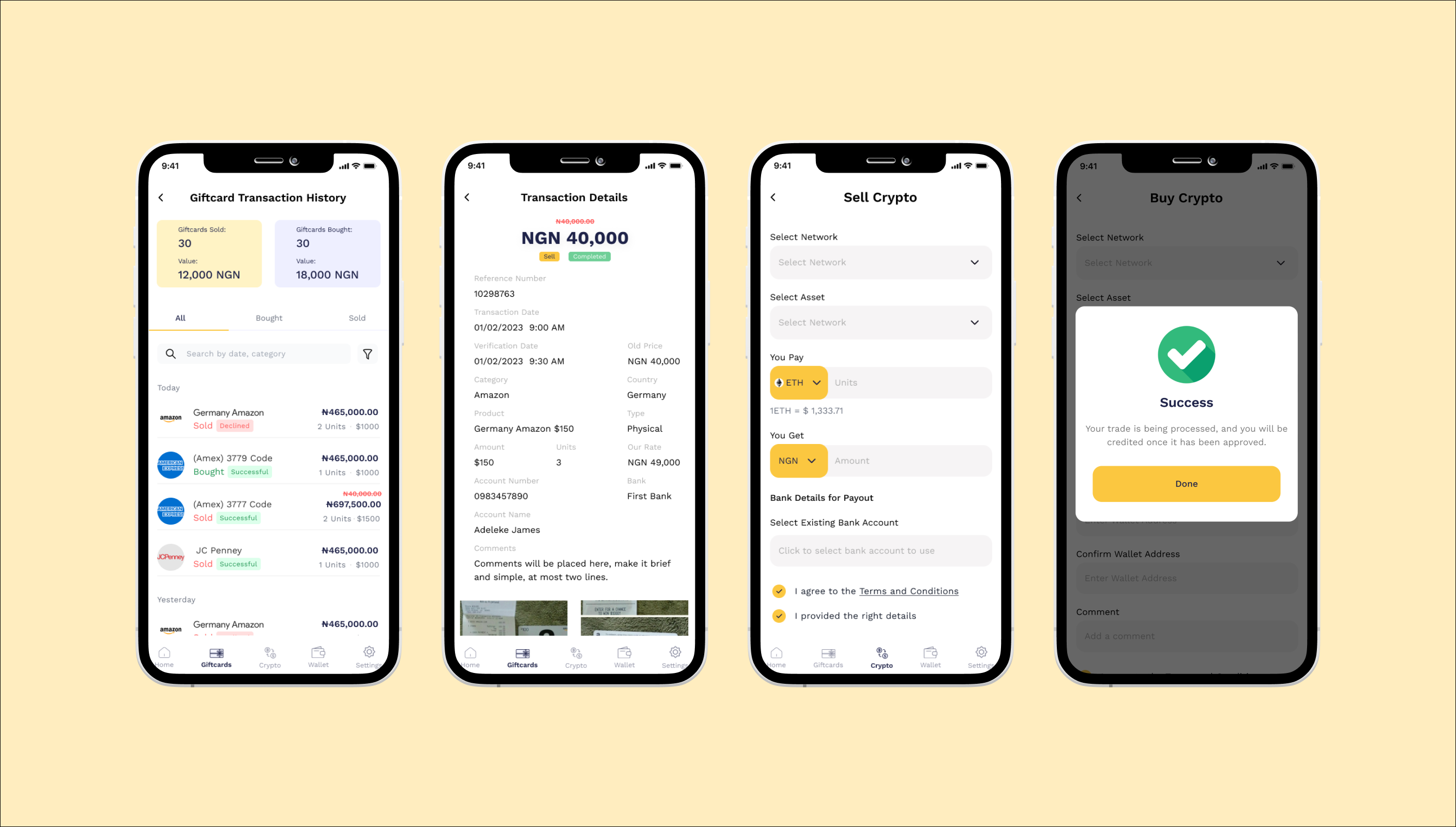
Users were losing confidence in the platform because they couldn't track what was happening with their funds. An unclear navigation hierarchy meant key actions — buy, sell, withdraw — were buried behind multiple taps.
We flattened the navigation hierarchy and elevated primary trading actions to always-visible positions. A dedicated transaction history view was built with filtering, status indicators, and a clearer portfolio summary at the top. The principle was simple: visible = trustworthy.
Insight 03 — Trading Experience
Expanding capability without overwhelming new users
Expanded the trading functionalities by offering new trading actions and providing users with detailed information about market trends. This allowed for a more robust trading experience.
Web App Redesign
Structural clarity over visual decoration
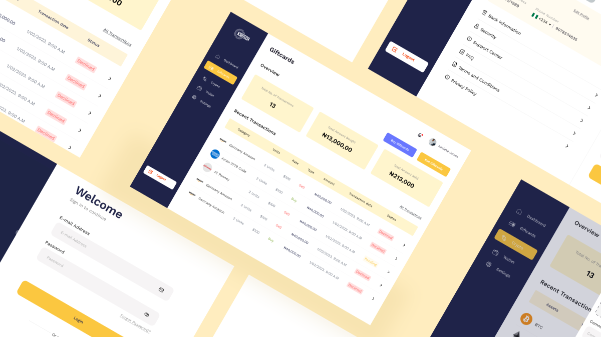
The web platform received a full information architecture overhaul informed by the same research insights. The priority was eliminating structural confusion — not adding visual complexity.
Key changes included:
Flattening the IA from 4 navigation levels to 2. Rewriting all menu labels using plain language validated with non-expert users. Adding inline help tooltips at every high-stakes decision point — deposits, withdrawals, identity verification. Introducing quick-action shortcuts for the three most common tasks (deposit, trade, withdraw) prominently on the dashboard.
The result was a platform that beginner and advanced users could navigate confidently — without a support ticket.
Website Redesign
The landing page had one job , and it wasn't doing it
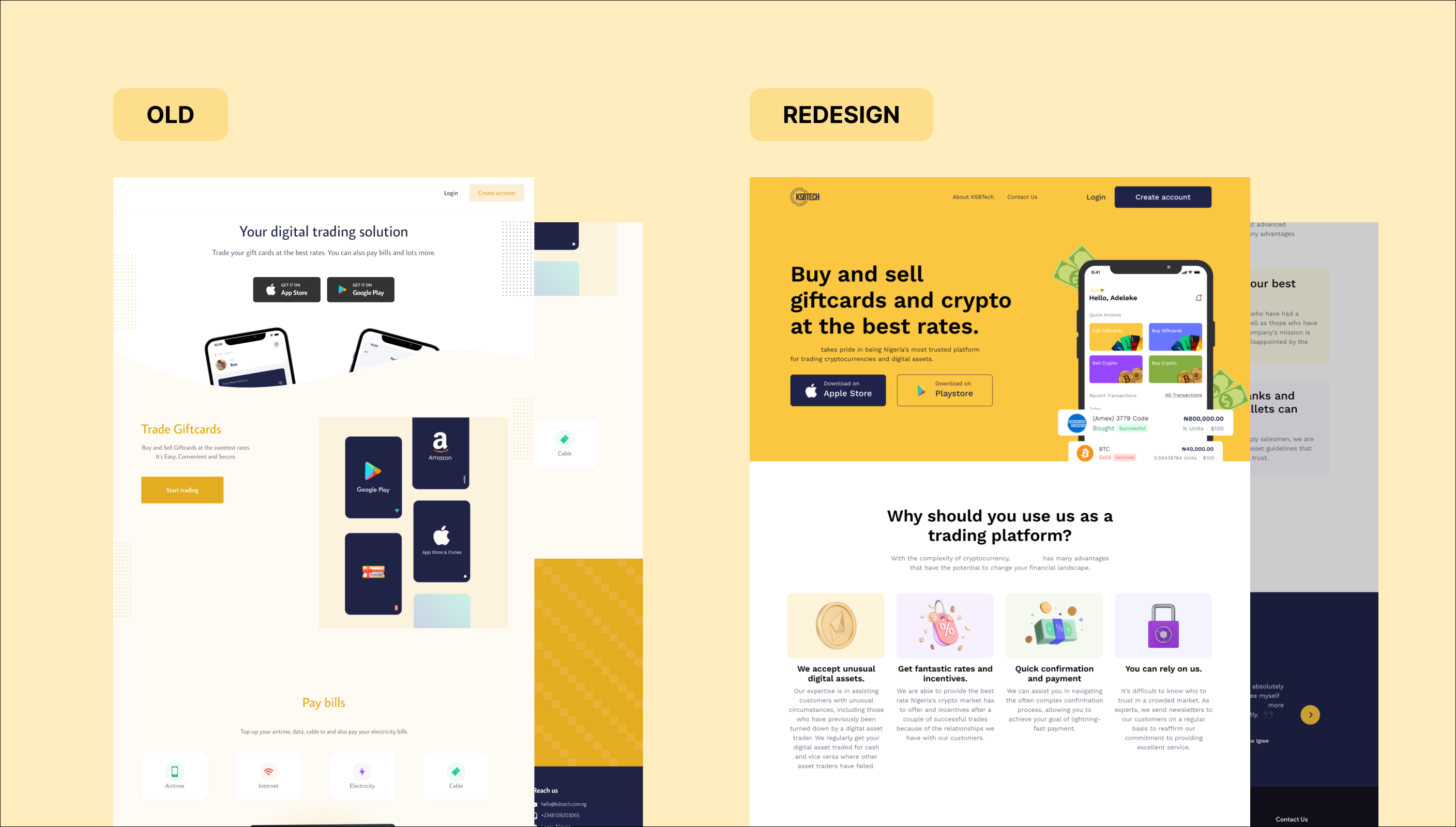
The old website buried the value proposition under dense, undifferentiated text. There was no social proof, no clear CTA hierarchy, and no acknowledgment that the platform served two very different audiences: crypto newcomers and experienced traders.
The redesigned landing page led with a sharp headline and above-the-fold benefits. Team credibility and security credentials were surfaced prominently to build trust before users even scrolled. Two distinct CTAs — one for beginners, one for experienced traders — reduced decision paralysis and improved sign-up intent across both segments.
Outcomes & Validation
Users noticed, in their own words
The clearest signal that a redesign worked isn't a metric. It's when users describe their experience using the exact words you were designing toward. These Play Store reviews, posted in April 2026, came back with the same themes: clarity, confidence, no confusion.

Learnings and Key Takeaways
What this project taught me
Three things I now bring to every fintech engagement:
Trust is the real conversion problem
Users don't abandon fintech apps because they're confused, they abandon them because they don't feel safe. Every design decision on KSB Tech was ultimately about reducing perceived risk. Clarity and confidence are the same thing in fintech.
Simplicity is earned through trade-offs, not assumed
Making a complex system feel simple requires understanding every edge case and choosing deliberately what to hide, surface, or defer. The Quick Trade view took the most design iterations of anything on this project, because simple is hard.
Inclusive design improves the experience for everyone
The accessibility-driven decisions we made for new users, better labels, higher contrast, progressive disclosure , consistently got the highest praise from our most experienced users in testing. Designing for the edge makes the centre stronger.